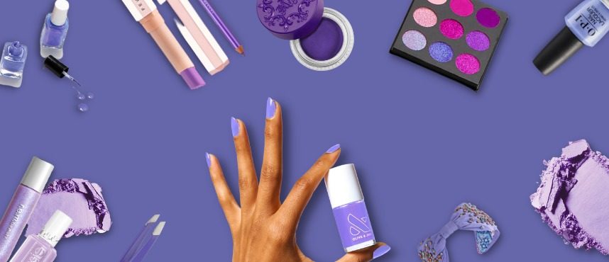
Pantone’s colour of the year, “Very Peri,” is a symbol of liberty that we all missed when the pandemic struck and forced us into a lockdown. There’s a different energy around as humans evolve and embrace a new culture that combines our physical and virtual presence. It’s dynamic, vibrant, and free from the barriers that hinder our creativity. The new colour represents that feeling.
Very Peri or PANTONE 17-3938 is an energetic blend of “dynamic periwinkle blue hue with a vivifying violet-red undertone.” It’s a colourful rendition of spontaneity, spritely, and the optimistic attitude that gives birth to the imagination, which is free from all the shackles of society. The colour psychology is that blue calls to mind feelings of calmness or serenity while the violet-red mix calls to mind royalty and courage, conveying just the right state of mind desirable for transformative change.
“The Pantone Color of the Year reflects what is taking place in our global culture, expressing what people are looking for that colour can hope to answer”, says Laurie Pressman, Vice President of the Pantone Color Institute.
Like the transformation and innovation occurring across the globe and different sectors, the institute pedaled the metal and created this new colour. The Pantone Color of the Year highlights what is going on in our society, reflecting what people seek and how that colour might help them find it.
For the first time in the history of our Pantone Color of the Year educational colour programme, the institute created a new colour to highlight the worldwide innovation and development that is taking place. As society continues to embrace colour as an important form of communication, a method to convey and affect thoughts and emotions, as well as engage and connect, the intricacy of this new red-violet laced blue hue emphasises the vast possibilities that lie ahead of us.
As much as colours are a part of our ecosystem, we also find them in all the inanimate objects around us. All gifts of the age of capitalisation that being the products and their packaging, also carry a variety of colours. Based on the simple principle that colours trigger a certain set of emotions in the human mind, businesses strategically strive to use colours in their products and packaging.
Very Peri has accurately captured what we humans are feeling at the moment. Having said that, all eyes are upon the beauty industry to see how it does justice to the thought behind this bold shade?
Like other businesses, the cosmetics business uses and flourishes on this principle as well. Skin moisturisers, fragrances, lipsticks, fingernail polishes, eye and face make-up preparations, shampoos, permanent waves, hair colours, toothpaste, and deodorants are examples of cosmetics. Strategic usage of colours in their range of products and product packaging makes it a booming and refreshing industry.
Colours used in this industry convey serenity, royalty, courage and similar emotions that make the colour a vital asset.
While the institute officially announced the colour this year, it has been on make-up artists’ palettes for quite some time. They have used it artistically to amplify the bold features of some celebrities. So, let’s look at its application and how you can wear it on your eyes, face, and nails.
For lightning lids
Apply a little highlighter to the lids as you apply the hue for a dewy appearance. This creates a unicorn effect that is too gorgeous to pass up!
For electric eyes
It’s a light hue that may be built up to become darker. Put on upper and lower waterlines to frame the eyes. Make it more dramatic by using mascara.
For inner eyes
To accentuate the inner corner of the eyes, you might choose a standard golden or copper tone. Combine it with Very Peri to brighten up the whole effect.
Glam it up
Take a cue from the original Lady Gaga, and glam up the simple application.
Apply some colour pigment to your lids, and you’re set to go.
For the matte-finish look!
The colour looks stunning as a solid tone with a matte texture, as Camila Cabello did on the Met Gala red carpet this year.
Smoky Look
Apply the colour in the outer corner of the eyes, around the flick of the winged eyeliner, to give a burst of colour to a classic smokey eye make-up look.
“As society continues to recognise colour as a critical form of communication and as a way to express and effect ideas and emotions and engage and connect, the complexity of this new red-violet-infused blue hue highlights the expansive possibilities that lie before us,” adds Laurie Pressman. Pantone sees Very Peri as a step towards the transformation of the cosmetic industry.
About Pantone Colour Institute
Pantone Colour Institute is the business unit within Pantone that highlights the top seasonal runway colours, selects the Pantone Colour of the Year, forecasts global colour trends, and advises companies on colour for product and brand visual identity. Through seasonal trend forecasts, colour psychology, and colour consulting, Pantone Colour Institute partners with global brands to effectively leverage the power, psychology, and emotion of colour in their design strategy.
Neelikon has an extensive range of colours to suit this shade. These are both water soluble dyes and finely ground pigments. For more information you may please contact us at info@localhost


